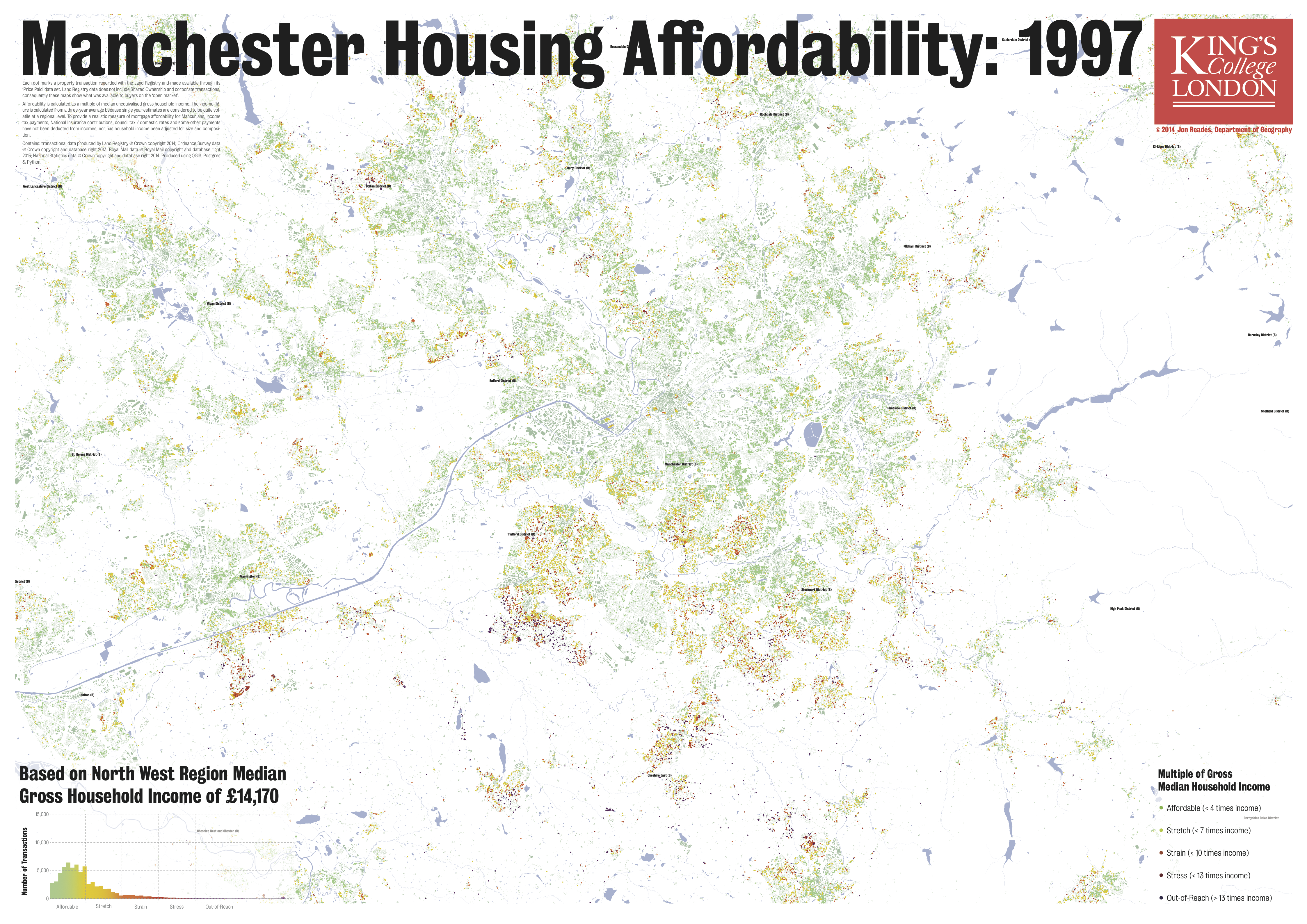
Building on yesterday’s post about my London affordability maps, here are the equivalent maps for the Manchester area (sorry Liverpool, I’ll get there!) from 1997 and 2012. It’s obviously a very different picture in terms of price, volume and distribution; these differences were well-known anecdotally but a lot of the detail was hidden until the Land Registry opened up its pricing data and, for my money, this represents one of the most useful and timely open data sets available.
1997 (10MB)
In all of these maps you can see the impact of the Stamp Duty on pricing: there’s a huge incentive to come in just below each of the thresholds and it’s particularly obvious in the 1997 map below. The really striking thing about this map for me, however, is the very different pattern of affordability: in London it’s all about proximity to the city centre (i.e. West End), here it’s quite clear that it’s the Southern periphery (e.g. Trafford) and the smaller towns beyond that are considered desirable for a host of different reasons.
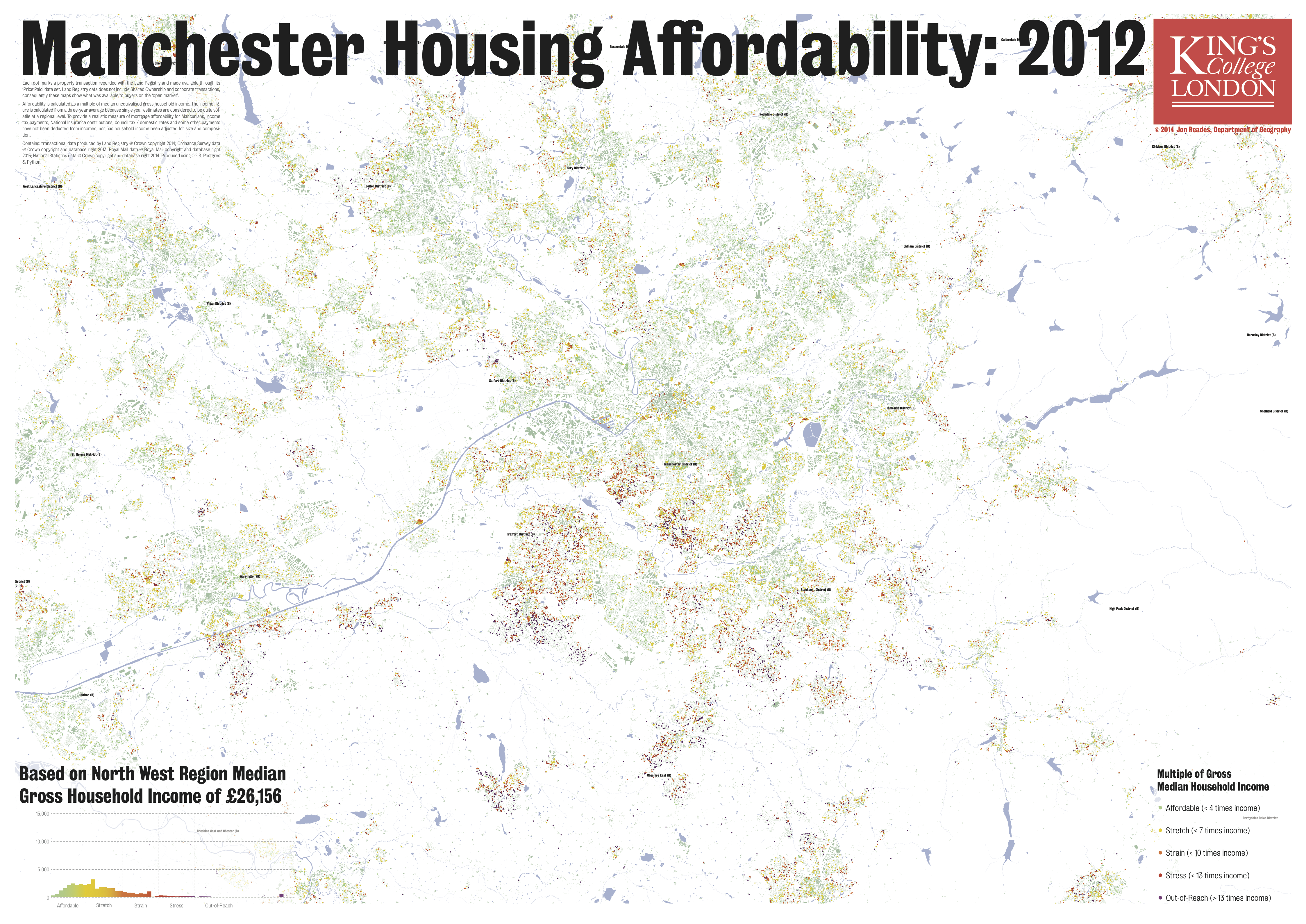
2012 (10MB)
Run the picture forward to 2012 and a few things become clear: first, that there has been nothing like the loss of affordable housing options that we saw in London; second, that the regeneration of the city centre is having an impact on prices within the Central Business District; and third, that just because housing remains relatively more affordable doesn’t mean that there aren’t parts of Manchester that are starting to look a little like London. Notice the changes to the south of the CBD and in Trafford: there are clearly areas in which people are still able to find affordable housing to purchase, but there are now areas where it also fairly clear that it will be very difficult for anyone on the median income to get a toe-hold.
 I should note that I’m not particularly savvy about the Manchester housing market so I’ll leave it to others to interpret these findings in greater detail; however, I thought that it would be really interesting to explore other parts of Britain using the same methodology I’ve used to explore London so as to develop a set of visualisations that are more directly comparable and more closely linked to the regional dynamics of income and access than crude averages or raw prices. Enjoy!
P.S. One thing that struck me about looking at Manchester is the impact of zoning – some postcode areas have no open market transactions at all. My attempts to double-check that I hadn’t made a mistake in my coding suggested that most of the ‘no sale’ areas are industrial zones of one sort or another. In London you really don’t see this sort of delineation at any smaller scale though it does, of course, exist at the fine scale.